
I had the hardest time with today’s color challenge. But I really want to get back into participating in the challenge and I kept at it. I think my card would look a lot prettier without that Ballet Blue in there…but what can you do? I really wanted to make this card qualify for the challenge. Bright colors are SO out of my comfort zone.
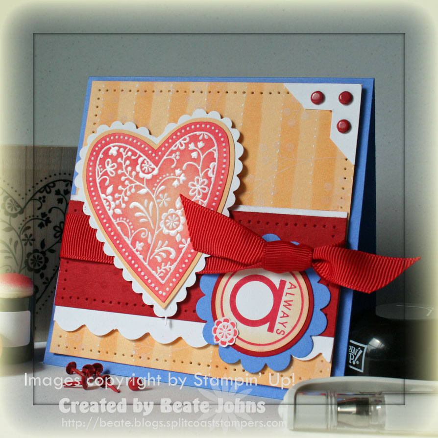
My card base is a 4 1/4″ x 8 1/2″ piece of Ballet Blue cardstock folded in half.
Next comes a 4″ square of Apricot Appeal. I sponged stripes with help of the long retired Stripe Templates and sponge daubers.
Then I added white dots along the left hand side of each stripe with the white gel pen.
It still didn’t look quite right, so I stamped the branch with white craft ink over the entire square. I added a paper pierced border on the edges of the square and a small white photo corner topped with three real red brads.
The Real Red horizontal strip measures 1 1/2″ x 4″. It was stamped with the branch in Real Red. The edges were sponged in the same tone and paper pierced. This layer was added on a 2″ x 4″ piece of Whisper White cardstock. The bottom of the white cardstock was scalloped with the corner punch. I tied 5/8″ red grosgrain ribbon around both layers.
I stamped the heart from Always in VersaMark on Whisper White cardstock and embossed it with clear embossing powder. I then added color to it first with Apricot Appeal, then with Real Red classic ink and sponge daubers. I cut out the heart, layered and cut it on Apricot cardstock, then adhered it to white cardstock and cut around it with non-Stampin’ Up! scalloped scissors.
I stamped the sentiment in Real Red on Whisper White cardstock and punched it out with 1 1/4″ circle punch. Next I sponged it with Apricot Appeal ink and sponge daubers. It was layered on a 1 3/8″ Real Red circle and a Ballet blue Scalloped circle.
Beate
48 Responses to “Not my kind of colors”
Sorry, the comment form is closed at this time.


Oh I think this turned out gorgeous! I completely relate to the bright colors being outside your comfort zone, I can’t ever seem to use anything in that group other than red or green during Xmas time. Perhaps I’ll have to challenge myself!
This is really pretty! I love this card. I’m not a real bright – bright colors person either, perhaps this challenge was good for me! I’ll have to try it, though I know it won’t come out quite like it should… 🙂
Wow! I wish cards I wasn’t too crazy about turned out like this!! You did a fantastic job, as usual!!
I disagree- that Blue looks gorgeous. I love the way you embossed and colored the heart!
aaah.. GORGEOUS!! the Ballet Blue in there is Perfect! Now you’re talkin’ my “bold brights” language 🙂 🙂 Love it! Of course.. EVERYTHING you do ROCKS my world anyway!! 🙂 hugs, Patty
You did great, love this set works together…mine is coming the end of the week. I like how your heart has some apricot in the center, your colors blend so nicely. TFS!
I often have a difficult time with bright colors too (earth tones are more my style), but this turned out beautifully. It’s gorgeous!
What a beautiful card. I love the hart.
love this card. your blog is wonderful. you are so inspiring. thanks for sharing all of your wonderful works of art!
I love it! Way to keep at it.
This was a tough one for me, too. You really rocked it, though.
I think it looks beautiful, Beate! You’re definitely braver than I am…I would have seen those colors and gone running the other way, but you did a wonderful job putting them all together. I like that the blue is the accent color…really nicely done!
~Michelle :o)
You pulled this off wonderfully Beate! I haven’t done the challenge yet today. Funny, I was thinking that Ballet Blue isn’t my colour either. I do like bright colours though. Been using them a TON lately…lol
it’s perfect…i love it!
Your card is fabulous!!!
I know what you mean! I’m not really a Ballet Blue person either. But even though the colors are different, it still looks like a Beate card! Good for you for stepping out of your comfort zone.
This card is just wonderful, and thanks so much for sharing that you struggle sometimes…it is very comforting to know I am not the only one! Thanks for sharing! Laura
wonderful card for the color challenge! I think it’s perfect!
This is lovely! I really like the heart, it’s just perfect for Valentine’s day!
This is so beautiful, Beate! I love your use of the colors! Gorgeous!!! TFS
So pretty! I had such a hard time with those colors today! You really pulled it all together so beautifully! Love it!!!
OMG Beate!!! What a BEAUTIFUL card. Thank you for the inspiration.
I LOVE LOVE LOVE those colors..but then I’m a bright color sort of person…LOL
Great job on this card!
It’s really wonderful I like it this way 🙂
For something that is not your color scheme, you certainly did a wonderful job with it. I love the striped background.
hey Beate,
I think this card is great!! I love your two toned sponge daubing…do you have a tutorial for that on SCS or is it a lot easier than what I’m thinking? Thanks for a great blog!!!!
So very cute! I so want to be one of your customers who gets to learn from you! Your cards are so awesome! You never miss a single detail! Perfection! Thanks for sharing and have a wonderful night! 🙂
I love your two toned sponge daubing…do you have a tutorial for that on SCS or is it a lot easier than what I’m thinking? I think the card turned out nicely! Thanks for a great blog!!!!
This turned out sooo beautiful!! I really love all the scallops and paper piercing you’ve done! You did a fabulous job with the color challenge, Beate!!
If that is what you do when your not in your comfort zone…….
You dont give yourself enough credit.
I think the colors look great together 🙂
I love your card! I think it is perfect for the challenge! I am trying to figure out what mine is going to look like. I want you to know that I admire you so much. You have a lot of talent!
This turned out great! I love how the colors went together.
Super Cute layout too!
Hugs,
Michelle
For something that is out of your comfort zone, you did great! I like this card. I would never have thought the colors would work together, but you made it work. I think it is because you go the extra distance in putting in so much detailing in the card. I guess that is why I am always stopping by your blog. You go the extra distance.
Beate, that is too funny! I always thought you used bright colors! You do, compared to me. And because of you, I have started to use colors I would normally never use. Like pumpkin pie striped ribbon in a card that has no pumpkin pie in it! It’s all relative, I guess. But, I am with you on that blue. I didn’t do the challenge because I was just not feeling the energy to make that blue work! Your card looks great, by the way.
Not your usual but outrageously gorgeous none the less.
🙂
These may not be “your colors”, but the card including the colors is beautiful! I really do love it! Jeanne
This card is absolutely gorgeous! Thanks for sharing.
You and Jenn are ridiculous. But then I guess we are all our own worst critics. This card is beautiful — AS ALWAYS — your creations are always just gorgeous. I wish I had the talent in your pinky!!!
/p
For something you say is not your colors….this is awesome!
Beate, this is so fun! I do not work well with “primary” colors and definitely would not have ended up with a card as lovely as this!
Beate, I love your card! It was perfect for Super Tuesday. I was watching CNN last night thinking someone should come up with a challenge based on all the colors of all the graphics and gadgets those news guys kept using. Maybe I just need to stamp or take a break. Maybe it was the thunderstorm or my lack of chocolate or the fact that my kids kept waking up from the thunder…but when I saw this card it was just perfect for those CNN guys–two shades of yellow, ballet blue (which was Hillary’s color)…and the reds. Huckabee’s color looked like groovy guava. McCain was close to real red. Someone else looked like cranberry crisp. So fun! Hope you don’t mind this novel of a comment from one tired mommy. 🙂
This is a beautiful card! I especially love the way you did the heart. I’ve just ordered heat embossing stuff so I’m always looking for ways to use it!
Oh, Wow! Beate, I dont know why you feel so uncomfortable with these colors! You did a wonderful job! I have not done the challenges in a long time. I will have to try to do something with this color combo.
Thanks!
Well, for not being your kind of colors, you did a FABULOUS job! It’s perfect!
Not your colors…but it’s gorgeous! You did a super job with it, of course! 😉
Great card!! I’m sad that I didn’t play yesterday’s challenge, so many cute cards…now I’m too busy with my new order from the new mini!!
You couldn’t make a bad card if you tried!!! I didn’t even attempt this combo — you did a fantastic job with these colors!