
Today’s tutorial on Splicoast is for a VERY basic technique that I use almost as much as paper piercing – sponging. I thought it was time to just write a quick tutorial on the basics of sponging. I do still get questions about that.
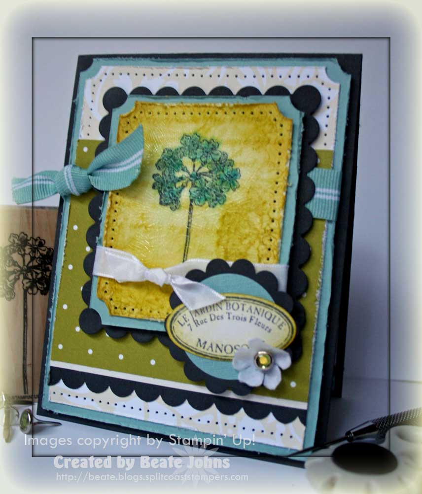
My card base is a 4 1/4″ x 11″ piece of Basic Gray cardstock folded in half.
The next two layers are a 4″ x 5 1/4″ piece of Baja Breeze and a 1/4″ smaller piece of Bella Bleu Designer Paper. On both layers the edges were distressed with the cutter kit and the top corners were punched with the ticket corner punch.
The designer paper is from the Kiwi Kiss Pattern Designer paper pack and measures 3 1/4″ x 3 3/4″. Baja Breeze Ribbon was tied around the upper part of the paper.
I stamped the image from Le Jardin Botanique in Basic Gray on Shimmery White Cardstock. It was colored with Baja Breeze, Pacific Point and Kiwi Kiss ink. I then masked the image and stamped En Francais in second Generation Kiwi Kiss over it. I also added a few of the same images in second generation Kiwi Kiss. The edges were paper pierced and then sponged first with Barely Banana, then with Kiwi Kiss. It was layered on a 1/4″ bigger piece of distressed Baja Breeze designer paper. I added a layer of Crackle Effect over the image. While I LOVE the crackle look, I didn’t like that it changed my sponged colors a bit.
Once the Crackle Effect tried, I tied White Taffeta Ribbon around both layers and attached them to a Basic Gray Rectangle Scallop that I had cut with Nestabilities.
I stamped the sentiment in Basic Gray on Shimmery White cardstock, punched it out with the large oval punch, layered it on a 1 3/8″ Baja Breeze and scallop gray circle. To finish it off I added a small flower from the Pretties kit with an Ice circle Rhinestone brad.
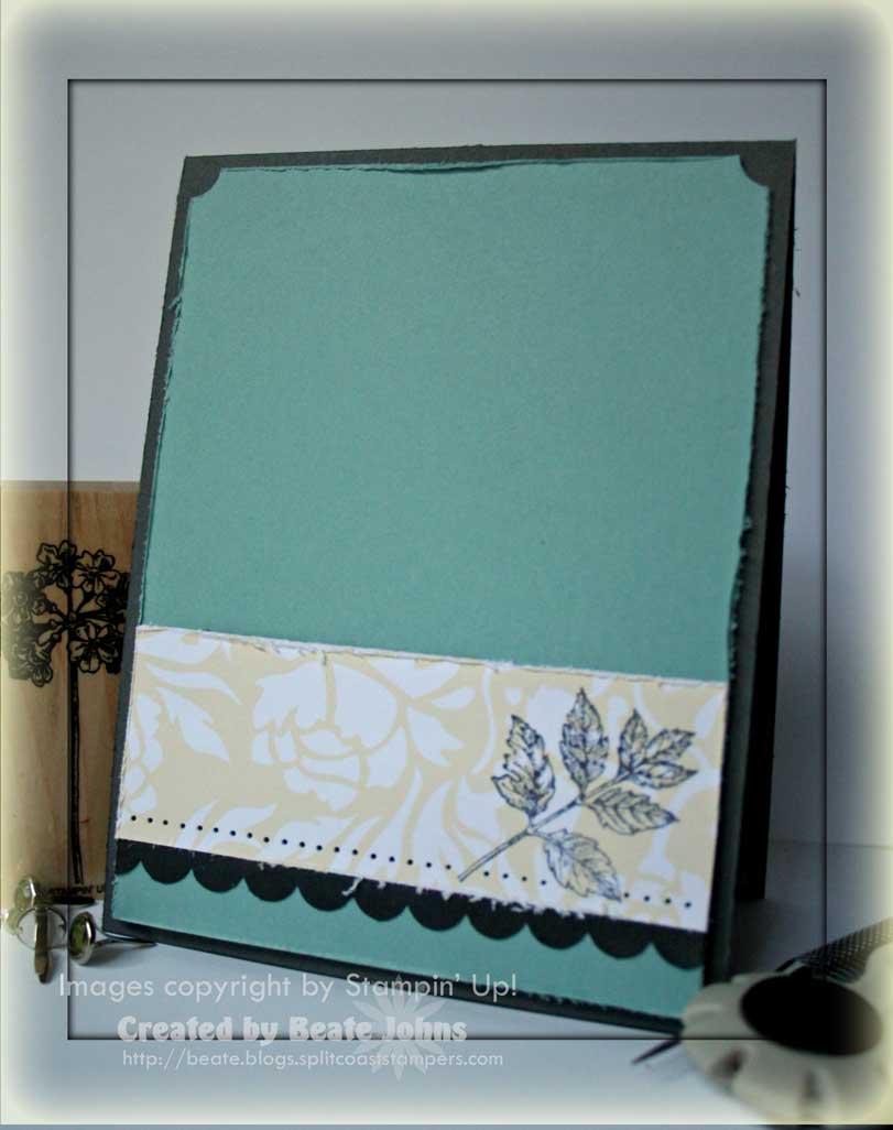
For the inside I layered a 1 1/4″ x 4″ strip of Bella Bleu Designer Paper on a 4″ x 5 1/4″ piece of distressed Baja Breeze cardstock.
Underneath the Designer paper I layered a thin gray strip that was punched with the scallop edge punch.
I stamped the leaf from Le Jardin Botanique in Basic Gray on top of the designer paper.
Beate
21 Responses to “Tutorial on SCS – Sponging”
Sorry, the comment form is closed at this time.


I love it Beate!! You are such an inspiration!!!
This is absolutely beautiful, Beate. Love the colors and everything about the card is just perfect.
This is gorgeous, and I love all of your fabulously distressed layers!! The Crackle Effect gives a nice texture as well!! Beautiful!!
I will look forward to seeing the tutorial – sponging is something I can do but but know I could do a lot better. Great colours (even if they changed a bit) and how neat is it they way the scallops and punched corners work together so well.
Wow! This is gorgeous!!
Oh my goodness, Beate — this is gorgeous! I just love the depth and texture!
It’s so funny, I always tell my customers that there is a difference between SPONGING and sponging, and they always laugh at me… This is another gorgeous creation! If I havent told you lately, I really enjoy your blog. Every creation somehow seems more beautiful than the next. They are all fabulous.
WOWZER Beate!! This card is just GORGEOUS!! I love the colors!! I for one, love to sponge!! 🙂 TFS!
Wow, this is gorgeous! The color combo you used was just fantastic!
Oooh… scrumptious!!!
Cindy
Beate, deine Karte sieht traumhaft schön aus. Die Farbkombi ist genial…ganz zu schweigen von dem Stempel…WOW…;-) Liebe Grüße…
Gorgeous card!!
Love this! I need to remember to go back to the basics every now and then. You make this technique so elegant and shows how it adds just the right touch. Great card! Thanks!
Gorgeous card! Love the sponging. Awesome colors.
Gorgeous Beate! Love that crackle on there…so pretty!! All your layers are wonderful too! Hope to try some sponging soon. I love the look but have never acheived a very good effect on my paper…will give your tutorial a go for sure!!! TFS!
This is lovely, Beate! I love how you layered up the stamps in the main image. And your tutorial is great – it’s always good to get back to basics!
Just beautiful! LOVE those colors!
This is gorgeous, Beate!! I love all of your fantastic distressed layers!! So beautiful.
xoxo BA
I feel like I repeat myself all the time but your cards really are fabulous! I love the color combo’s you use and all of the layering.
so pretty, love your shading, I am still working on this…neat sentiment too!
So lovely, Beate! The rich warmth of the golden yellow edges is so dramatic and effective!