
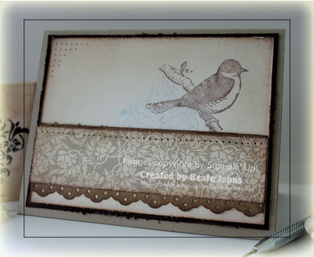
Very Vintage was yesterday’s Way to Use it Challenge. I had no vintage supply at home, but thought a little distressing and sponging might get me the vintage look. The challenge worked well for today’s sketch (at least I think so).
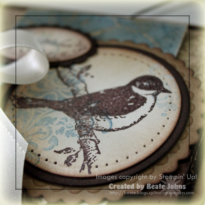
I thought of the stamp set Friends 24-7 right away. I simply love that set. The damask image and the bird are some of my favorite Stampin’ Up! images. I stamped the Damask in second and third generation Brocade Blue ink on Shimmery White cardstock. Next I stamped the bird in Chocolate chip craft ink over the the damask and embossed it with clear embossing powder. I cut it out with Circle Nestabilitites and sponged the edges first in Creamy Caramel then with a hint of Chocolate chip ink. The circle was adhered to first a slightly bigger sponged Chocolate Chip circle, then on a scalloped and sponged (first with creamy caramel, then with chocolate chip) Kraft cardstock circle.

The card base is a 5 1/2″ x 8 1/2″ piece of Kraft cardstock folded in half. It was sponged with Creamy Caramel and Chocolate chip ink. The next layer is a 3 15/16″ x 5 3/16″ piece of Chocolate Chip cardstock that was distressed and sponged. Why the weird measurements? Lately I like my first layer to be just a tad smaller then my regular 1/4″ smaller layer. It makes the card base show more and the second layer show a little less. The next layer is a 3 3/4″ x 5″ piece of Bella Bleu Designer Paper. It was also distressed with the cutter kit and sponged first with Creamy Caramel and then with Chocolate Chip ink.
The blue designer paper is also from the Bella Bleu pack. It was crumpled up, smoothed out, sanded, sponged and paper pierced. It measured 3″ x 3 3/4″ before I punched the bottom edge with the Eyelet Border punch. A 1 7/8″ x 4 3/4″ piece of sponged, distressed and paper piercedpiece of Kraft cardstock was taped underneath. I punched two holes next to each other (to make the opening bigger) in the middle of the left hand side of the Kraft strip with my Crop-a-dile, threaded May Arts Cream Satin ribbon through the opening and tied a bow. Then I taped these layers to the card base with dimensionals.
The sentiment is from Oval All. It was stamped in Chocolate Chip on Shimmery White cardstock and punched out with the large oval punch. Next the damask image was stamped over the left hand side in third generation Brocade blue. Again the edges were sponged first with Creamy Caramel, then with Chocolate Chip ink. It was layered on a sponged Chocolate Chip Scallop Oval Punch-out and adhered to the card base with dimensionals. To finish off the card front I added three pearls from the Pretties Kit to the left hand side with Crystal Effect.
As always, the inside of the card has components of the paper and stamps I used on the card front. The distressed and sponged Chocolate Chip layer measures 3 15/16″ x 5 3/16″, followed by a 3 3/4″ x 5″ piece of Shimmery White cardstock, that had been distressed and sponged as well. I stamped the bird in second generation Chocolate Chip Ink to the top right and added the damask stamp in third and fourth generation Brocade Blue over it. The left top corner was paper pierced.
The designer paper strip measures 1 1/4″ x 5″. It was sponged and distressedbefore it was adhered to a sponged strip of Kraft cardstock. The strip measured 1 3/4″ x 5″ before the bottom edge was punched with the Eyelet Border punch. After everything was adhered and photographed, I thought the strip could have been a bit thinner and it would have looked better. Oh well…too late.
Have a wonderful weekend! I hope you have time to play! Hugs and smiles
Beate
35 Responses to “Vintage Bird”
Sorry, the comment form is closed at this time.


WOWWWWW, Beate! AWESOME card!!
gorgeous as always! So very you with the blues and browns. .. (PS! I got mail yesterday! thank you!)
This image, along with distressing and sponging equals vintage in my book! Such a stunning card, Beate!!
Oh goodness me. Do you know HOW hard I have been fighting saying I don’t need this set and every time I think I say ok I don’t need it you come up with a DO DIE for amazing beautiful card.. I think this is it.. I DO NEED THIS SET!! 🙂 Love this card!
I agree with Denise… WOWWWWEEEEEE! Totally gorgeous Beate!
Have a great weekend my sweet friend!
Very beautiful indeed!
Gorgeous papers, colors and bird, Beate — thanks for the fun sketch!
This is my favorite SU set too, so I totally get why you love to use it!! This card is beautiful…I really like how you distressed the blue dp layer and added the pearls. Love it all!
Oooh, this is lovely! Very pretty!
Ohhh thsi is gorgeous!!!
Oh, wow, I am totally loving that card! I love the shabby chic look and this was done in a very elegant way. Pure perfection!
Cindy
This is gorgeous inside and out. Love all the sponging and texture. All those layers turned out to be just fine. 🙂 Have a super weekend!
Gorgeous card!
I love it. Great take on a distressed card.
Your sponging is just superb Beate. This is one gorgeous card! One of my fav SU sets that’s not a watercolor set.
Beautiful! I love EVERYTHING about it!
That is such a stunning card Beate….love the colours you’ve used on this.
These are stunning! Love them both!!!
This is stunningly beautiful! I find so much inspiration in your work! Thank you for sharing your talent on your blog!
Oh Beate… this is FAB-ulous! Your cards are always so Inspiring.. you put such care into each and every detail and layer creating the most beautiful cards inside and out! Always a treat for the eyes!
Just beautiful, Beate!!
so pretty, great design!
Just Beautiful!!! wow what talent..heck ya it works…TFS!
Mandy
Amazing, Beate! This is gorgeous!!!
stunning and awesome…as usual…thanks for sharing your fab talent…
((()))reen
I’m speechless girl!
You have taken my all-time favorite set and created a masterpiece!
WOW!!!
Beautiful Beate! So elegant with the colour combo you chose and the sponging is the perfect vintage effect! Lovely creation!
Just GORGEOUS Beate! LOVE that bow and those pearls! Have a wonderful weekend!
so, so beautiful , Beate!!!!!!!!!!!i just love the sponging and distessing!!!!!!!!!
great dsp background !!!!!!!!!!!!
tfs:)
chat
So gorgeous!
This is soooo gorgeous, Beate!! I love the rich colors, pretty papers, and beautiful images!! Amazing as always!!
This is incredibly beautiful.
Beate SU! shouldn’t be shovign themselves down peoples throats instead of welcoming some healthy compettition. I hope you continue on without them and keep us people educated withyoru great ideas and education! You do more good with SCS than u will ever know.. As a former SU! demo ( 2 x) I sent people to SCS and I sold more stamps because of it I always felt… But not without people like yourself there….. Stick with Tracy & Daven & your design teams.. Someone you know will give you their discount. If not then one of my freinds will. I promise So sorry for the heartbreak or slap in the face!
Kimmi
Beate, your work is exquisite–always! Hang in there, dear lady!
Gorgeous card, love the bird image!
Der Wahnsinn, diese Karte ist der Hammer !!! Ich bin sprachlos, sowas von schön und perfekt gestaltet.
Dieses Vögelchen *schwärm*
Liebe Beate, ich wünsche Dir ein wunderbares Wochenende.
Herzliche Grüße
von Anke