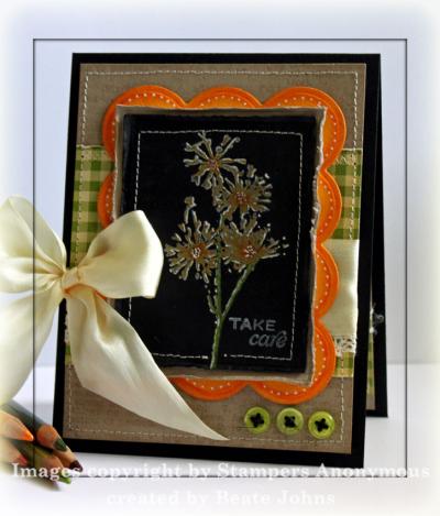
I usually try to use only stamps from one company on a card, but this one has three! The main image is from Tim Holtz Nature’s Discovery, then I needed a background stamp for the Kraft cardstock and used Unity’s Giving it All meaning. I only had a small spot for the sentiment and this one from Flourishes Taglines fit perfectly. The card was created for a Technique Challenge over on SCS. The challenge was to create a card with the Black Magic technique. I usually don’t like the look of this technique…but after playing with it for a bit, really liked how this card turned out. It looks better IRL.

I stamped the image from Nature’s Moments in Snow cap pigment ink on black cardstock and colored it with Prismacolor Pencils (Dark Brown, Marine Green, Limepeel, Yellow and Pumpkin Orange). It was cut out with Classic Rectangle Nestabilities. It was layered on the next size rectangle in Kraft cardstock. The layers were stitched together to give it an extra border and the edges of the cardstock was distressed.
I cut a a large scallop rectangle out of Apricot Appeal cardstock with Nestabilities, sponged it with Wild Honey Distress ink and added a dotted border with the Inkessential white pen. The image layer was attached to the scallop layer with dimensionals.
The card base is a 4 1/4″ x 11″ piece of Basic Black cardstock folded in half. Next is a 3 15/16″ x 5 3/16″ piece of Kraft cardstock. The layer was stamped with Unity’s Giving it all Meaning background in Watermark Resist Ink. A 3″ x 3 15/16″ piece of Fly A Kite October Afternoon Paper was distressed and stitched to the Kraft layer. May Arts Ribbon was tied around the layer and three green buttons ($1 bin at Michaels) were attached with black Burlap String. The layer was attached to the card front with dimensionals.
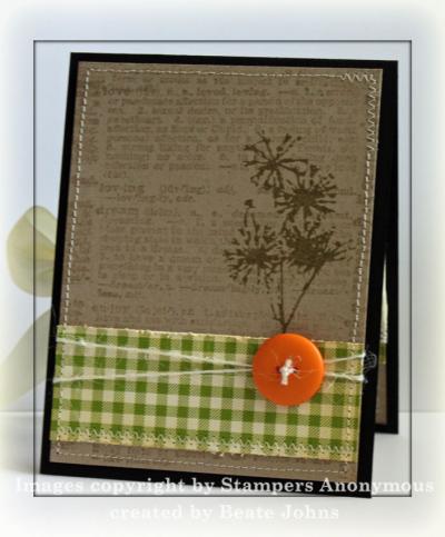
The card inside is pretty simple, but I really like how it looks. A 3 15/16″ x 5 3/16″ piece of Kraft cardstock. It was stamped with Giving it All Meaning in Watermark Resist ink. The image from Nature’s Moment was stamped on the right hand side with Frayed Burlap Distress Ink. A 1 3/8″ x 3 15/16″ strip of Flying a Kite Paper was distressed and stitched to the Kraft layer. I tied a Basic Grey Button to the layer with tiny twine from MFT’s Bakery Blend Ribbon.
Thanks so much for looking! Hugs and smiles
16 Responses to “Hodgepodge of Stamps”
Sorry, the comment form is closed at this time.


Stunning! I don’t normally like the black magic technique either and have never even tried it. Not sure why I’m knocking it then…lol BUT your card is awesome! I think the earthy feel really toned down that pop of white! Beautiful job!! So inspiring!
How beautiful Beate! Such a feast for the eyes in color and details…even the tiny white dots! Great use of this technique!
So so pretty! Love it Beate!
I’ve really become hooked on the Black Magic look. I really love your card! I had never seen this technique until a couple of weeks ago, and find that I really love it. I’m sure I will get over it, but just now it really catches my eye! Your card is lovely.
I love your color combo – the bright green and glowing orange grounded by the black and kraft neutrals! I love the inside too!
I just love visiting your blog. Everything here is so beautiful!
Wunder…wunderschön liebe Beate.
Liebe Grüße
von Anke
This is gorgeous! Love the colours! I too didn’t think too much of black magic until I tried it and saw it IRL!
Question: Do you mail a card like this or hand it to someone on account of the large bow? I love this but wouldn’t know how to send it!
I haven’t heard of this technique – must check it out. Your card turned out beautifully – but I know how you feel when it’s certain stamps don’t work with certain techniques – and then you find one that does and the creation is beautiful.
Have a great day!
Joan
Wowzers! This is totally gorgeous!!
Very nice! I like the color combination!
Seriously?! Beate, you totally rock my world. This is awesome. AWESOME, I tell ya! I love this color combination! The different textures/patterns are so pretty together! You mention that the inside is “pretty simple” but I think the inside is simply fabulous! Another fun technique I will have to put on my “to do” list!
Beate, this is gorgeous, inside and out! The colors, the texture — all of it is fabulous!
I think it is gorgeous!!
very pretty, just love these colors and the inside is great too!
Just gorgeous, Beate! Hope you’re having a wonderful weekend!