
Today’s color challenge is a challenge indeed. The color combo is Tempting Turquoise, Kraft and Green Galore. I NEVER use green galore. It’s sooo bright. Well…I tried. I knew I would use a lot of Kraft and white to tone those brights down.
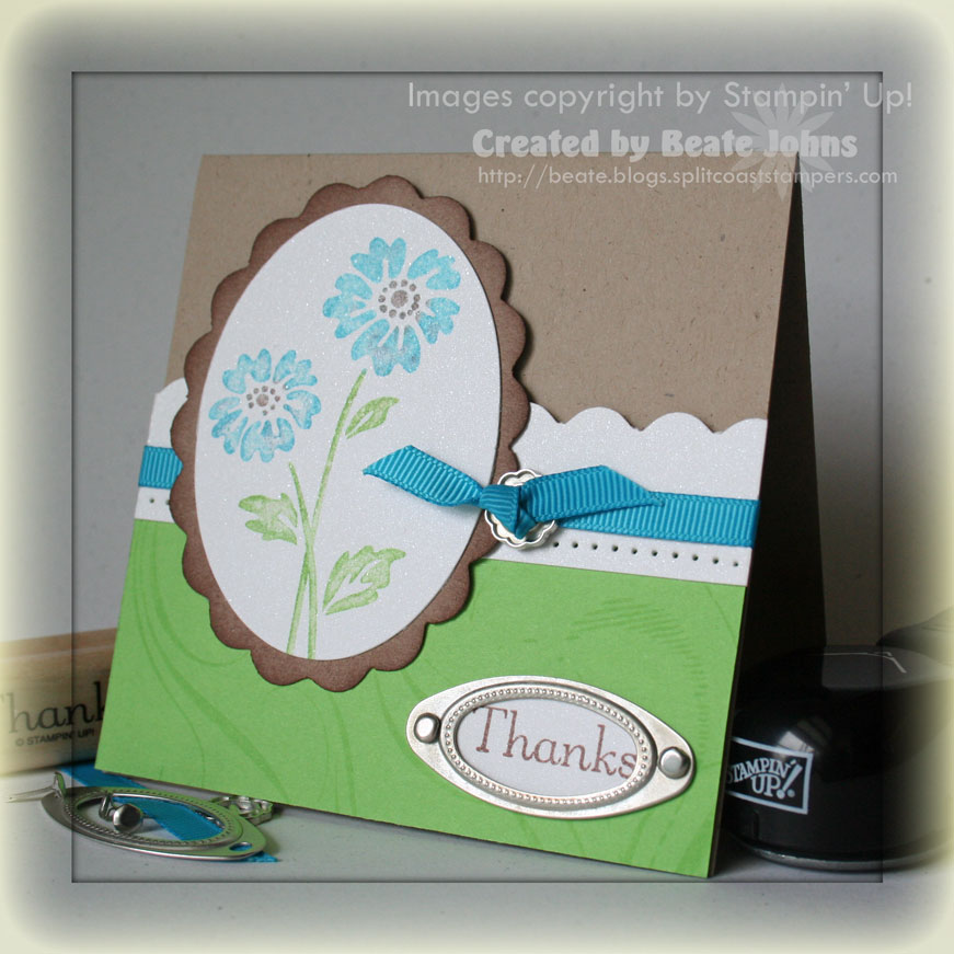
I started out with a 4 1/4″ x 8 1/2″ piece of Kraft cardstock folded in half.
I stamped French Flair in Green Galore on a 2 1/4″ x 4 1/4″ piece of Green Galore cardstock and taped a 1″ strip of Shimmery White cardstock on the top of that.
I used the corner rounder to scallop the top of the white strip, paper pierced the bottom of it and tied Turquoise grosgrain ribbon around it. You can see I used a ribbon buckle from the Styled Silver Hodgepodge Harware kit from the Occasional Mini catalog.
For the main image I inked up the flower from Live your Dream (Occasional Mini catalog) with Tempting Turquoise and Green galore and stamped it off once on scrap paper. Then I outlined the image again with the same colors and added Close to Cocoa into the flower center. I misted the image with water and stamped it on Shimmery White cardstock.
I cut the image out with my Coluzzle. Next I cut Kraft cardstock with the next bigger Coluzzle oval, added the scallops with the corner rounder and sponged the edges with Close to Cocoa cardstock.
Last I added stamped the sentiment in Close to Cocoa on Shimmery White, punched it out with the small oval punch and attached it with another piece of the Styled Silver Hardware kit.
Added note:
My scalloped oval didn’t come out quite right. I had a small piece leftover. I handcut it to a smaller oval and hid it behind the ribbon buckle.
Beate
26 Responses to “Definitely a challenge”
Sorry, the comment form is closed at this time.


WOW! I love it!
You made it look like a BREEZE! It’s beautiful, Beate! So fresh looking!
this is gorgeous, but I hear ya with the galore
Beate: I think you did an excellent job on your card!! The colors work really well on this card!
That’s too funny! I was working on cards for my workshop Friday & I used 2 of those colors not even knowing that those were the Challenge Colors – I picked Green Galore because I have a bit too much of it as I never use it, so I decided to go all out bright with Tempting Turquoise & Pink Passion! Well enough babbling!
I love you card, I think it looks great.
This came out beautiful! Very fresh and springy!
Very pretty Beate!! I tend to use Green Galore once in a while but not as often as I used to!
Great work as always. Your projects are so interesting. Thanks for sharing.
I have tried on numerous occasions to scallop an oval from my coluzzle but it never comes out evenly….what is your secret? Could this be a request for a mini tutorial?
Oh yeah…your card is beautiful…I think you do very well with bright colors.
These colors were a challenge for me too. You came up with a cute card (yet again).
Thanks for sharing.
I don’t often use the bold brights. I would never think to put them with Kraft. You certainly did that combination justice.
HUGS
This is really great! I like the way you pulled it all together.
I like the new hardware – great idea how you used it!!! Beautiful card!!!
I agree that these colors are a challenge together! Love your card!
Beate, you always make these challenges look so easy! Green galore and Tempting Turquoise? Yikes!! But you made it work! Great job as always ;o)
~Michelle
Fantastic job, Beate! I love the color combo and the hardware. TFS.
I was wondering if the corner rounder would work on round items. Good to know. Thanks for the tip.
I sure am loving the Kraft cardstock! It makes the colors just pop!
Gorgeous, Beate!!! You can make anything look fabulous! 😉
This turned out beautiful! It’s definitely not a challenge for you. Great job!
This is so fresh and beautiful!!
Beautiful! I really love this! Thanks for sharing! 🙂
Another beauty!! Can’t wait for my pre-order to come tomorrow! Thanks for the inspiration!
wow- those colors would be a challenge but you pulled them together beautifully!
Love this Beate!!! I use the Bolder colors quite a bit though!!