
I am not sure about this card. This is so out of my comfort zone, it’s not even funny! The layout for this card came from the new Creating Keepsake magazine.
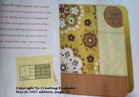 I loved the way this looked. Of course I had to get our new Petals & Paisleys Designer paper out and duplicated the layout and doodled the borders just like it is shown in the magazine.
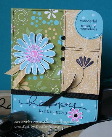
Well…..I like simple…but that looked just too simple to me. So BAM…I stamped the Flower from Polka Dots & Paisleys in black right in that lower section of the yellow paper. Later I wished I had planned the whole card out before doing something so drastic….but what can you do. It was on there. Next I used Amazing to Zany to add the words in the circle on top and Happy Everything for the happy message on the bottom. What can I say, I didn’t think it was enough yet. I am so wanting Prima flowers. Those would have finished this card off perfectly. I just ordered some yesterday and I can’t wait to get them.
I got out Looks Like Spring and added the big flower and the little one on the bottom. Lastly I added the vintage brad in the center of the pink flower and three black eyelets and the black ribbon.
So what do you think? Is it too crazy???? Usually when I am not sure about a card, I send an instant message to Jenn Balcer, my bestest friend and she helps me finish the card off. But she isn’t online! That’s just not right. So I am asking my new blogging buddies instead.
Hugs!
Beate
27 Responses to “Is this too crazy looking?”
Sorry, the comment form is closed at this time.


I absolutely love this card and expect to see a CASE really soon. It’s so balanced, so all I can say is WOW. I am loving your new blog by the way!
I think it’s busy, but it definitely works. You’ve got that triangle of three’s going on, with the upper right circle, the big flower, and the little pink flower, so eye “knows” where to look. I think it’s great that you just plunked a stamp down on the patterned paper. I need to get braver and be willing to potentially “waste” paper, as JanTInk says, because I know that will help me improve. 🙂
Uber Cool Beate! When I looked at it I thought….this looks like a pic out of a magazine! Fabu card! {{hugs}} for all of the inspiration you give to us!! Can i just secretly (ok…publicly) say when I grow up I want to be you!! Your artwork rocks!….as my teens would say…lol
I SO liked that you stamped on the patterned paper! I’m still developing a comfort level with DP and sometimes I really need to stamp on it too. It is a great card but I know what you mean about knowing if it’s just right. Sometimes I just have to try a few things before going back to my original plan. I think you are right about a horizontal black line but I’m curious about the ribbon – would black organdy be a little softer than black grosgrain or would it just be kind of muddy?
Hi Beate,
I really like the look of your blog. I am also a huge fan of your cardmaking style. I really like the card – I don’t think it looks crazy – “busy” might be a better word LOL.
I think the card works, because it follows the “rule of thirds” in its composition, and is balanced with the “triangle” as Jessica said. I like the strong colour of the black ribbon. It gives the card punch.
Wow, wow, wow! It is PERFECT! Love everything about it!
I don’t think it’s too crazy at all, I like it just like it is!
I like it – I think it works.
LOVE it Beate… LOVE LOVE LOVE!! I’m totally digging this new paper. I got to play this weekend too!
Love ya girlfriend!!!
It’s definitely an active scene! lol I think you tied the elements together well with the black touches. You know me and black! 😉 I would’ve popped this card in my favorites had I run across it on SCS. I wonder if you would’ve felt better about it had you stamped the flower on the right and the word sayings all in black? That’s the only thing that I could see that might have a more unifying effect. NONETHELESS, it’s an awesome card because, well, that’s all you’re capable of making, girlie!
I love how this one turned out! I am also in LOVE with this Paisley & Polka Dots set 🙂
What an awesome job you did? I just picked up a copy of the March Creating Keepsakes magazine. I will definitely give it another glance. Love the card,Beate!!!!!!!!
I love it!! I know you say you don’t like “bright” colors, but every time you do a “bright” card it’s so awesome. I love all your cards no matter the color combo, I’m a bright and subtle combo fan. I’m glad you use the other colors as it gets me out of my comfort zone when I “case” one of yours. I’m with Kendra, I want to be you when I grow up!!
I think it’s great. I love the patterns and colors. They all lead in to one another. Cool!
Beate, It is great, in my opinion. What I really liked is the way you kept everything contained inside an area except the circle. The line ends where the blue goes off the paper at each side of the circle. It gives a feel of being left open for many more things that could be said.
Nancy
I think it looks very nice, but then I love everything you do. I feel almost silly commenting all the time on your cards, cause I love them all. I almost feel insincere about commenting on all that you make, for that reason. I can not think of another lady that constantly does nice work that I like all the time.. Thanks for sharing.. Deb
Beate
OMG! This is not too busy. I just love your designs you are the best! You are one talented woman….keep sharing
Definitely adorable! This is simple, but funky. I love it. Bravo for going out of your comfort zone!
I like the card and I like the fact you used a scrapbook page to be inspired by. I could see this being reporduced by others.
Although it is a busy card, I love it! Everything goes together so well. Makes me feel cheerful!
Great job, so cheerful!! All of the elements go together perfectly!
I am learning so much from you! I wouldn’t have thought to put all of those elements together. I have to get braver, I think!
Sara
I like the card…just not those black lines…
Hey Beate- You forgot to mention you usually run it past your SAM too but now she isn’t allowed to be online. 🙁 I agree it’s different than most of your work but to be honest I really like it. I am off to search your gallery in hopes of finding a manly birthday card. My manager’s birthday is Wednesday and guess who is in charge of getting a card made, yup me. Not sure when I will have the time this week. I am doing the teleconference on tuesday and am VERY nervous, wish me luck. Keep the samples coming!! Love your SAM
I love the use of different techniques and thy way you blended them together to achieve a striking card. I inspire to do work of this caliber. IT certainly is not to busy.
Tammy
OMG!!! I SSSOOO love this! Mind if I CASE it?
I absolutely love this card! You are sooooo creative! You go girl! Happy Stampin’!!