fllccherryblossombookmarkwi.jpg

Today’s tutorial on SCS is for a corner bookmark. I made the sample for this back at the VSN at the end of May and thought it would make a great tutorial. It has been a technique challenge on SCS a while ago, but I had never tried it before VSN.

fllccherryblossombookmarkvs.jpg

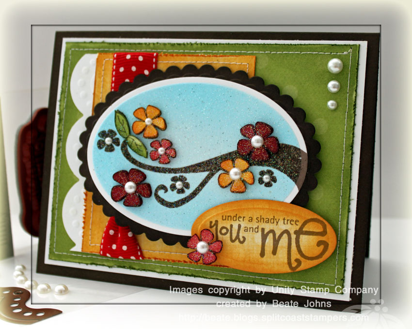
The bookmark base is a 4″ square of Sno Cone cardstock. The top corners were folded in and the bottom edge was cut and embossed with Eyelet Borderabilities. The edge of a 4″ wide strip of Pink Pirouette cardstock was cut with a Long Rectangle Nestabilities and layered with Fly A Kite October Afternoon Paper. The edges were stitched and a pink silk ribbon was tied around it.

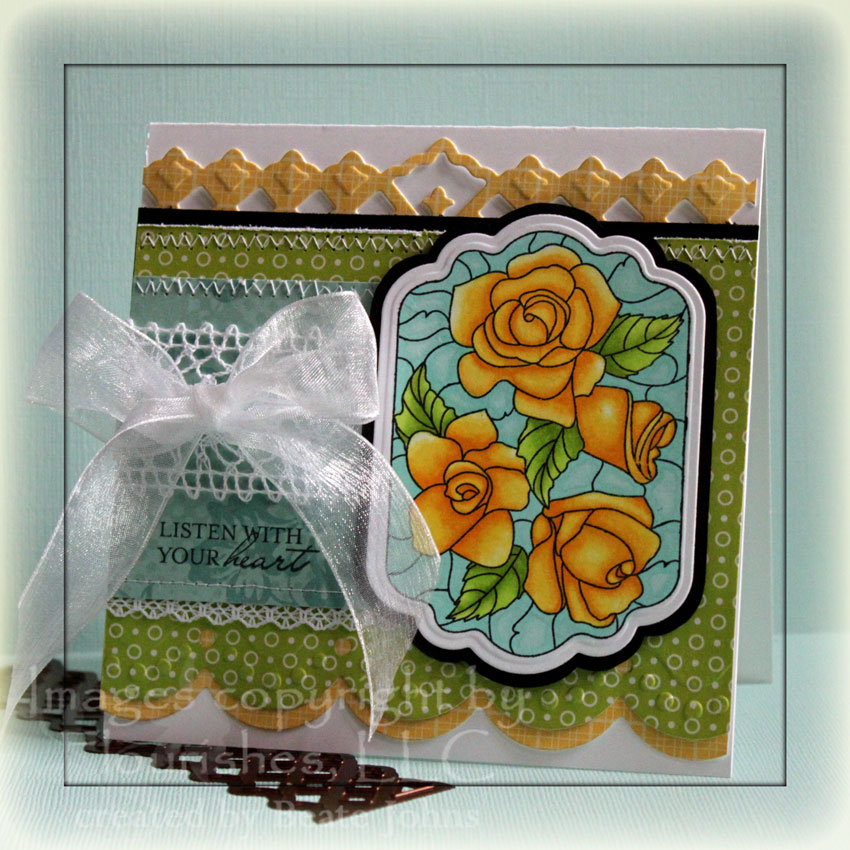
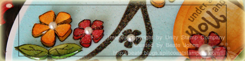
The image is from Flourishes Cherry Blossoms set. It was stamped in Tuxedo Black Memento Ink , colored with Copic Markers (E29, YG93, YG95, YG99, R01, R32, R35, R39) and cut out.  A piece of Solar White Neenah Cardstock as well as a piece of Chocolate chip cardstock were cut with Label 3 Nestabilities. The white piece was airbrushed with Copic Marker BG10 while the Label die was still on. The cut out image was adhered to the label with dimensionals. The Chocolate Chip layer was sponged with Walnut Stain Distress ink before the white later was attached.

Here is a video for the visual learner:

[youtube]https://www.youtube.com/watch?v=OSikT1Gjgyk[/youtube]

fllcjun10beautywithinbluwid.jpg

I created this card for Flourishes Color Challenge a couple weeks back. It was the first time I played with Flourishes Beauty Within set. I have to say I really like it. It was fun to color. I stamped it in Tuxedo Black Memento ink on Neenah Solar White cardstock and colored it in with Copic Markers (BG10, BG11, YG01, YG03, YG25, Y13, Y15, Y19). It was cut out and embossed with Label 11 Nestabilities. I traced the outside of the die on black cardstock and cut it out so I would have an 1/8″ layer to adhere my image to.

fllcjun10beautywithinblueye.jpg

The card base is a 5″ x 10″ piece of Neenah Solar White cardstock folded in half. The lower edge of a 3 3/4″ x 5″ piece of Nightlight October Afternoon paper was cut with Jumbo Scalloped Borderabilities. A thin 5″ wide strip of Thrift Store October afternoon paperwas cut with the same die and layered underneath. The top of the Nightlight paper was layered first on a strip of a Basic Black cardstock, then on another Thrift Store paper piece. This one was cut with one Lattice Borderabilities die.

The horizontal paper strip measures 2 1/2″ x 3″ and is from the Daydream collection from October Afternoon. The small strip of lace (Walmart) was stitched on the bottom layer. The bottom of the strip was stitched as well. May Arts Crochet Lace was adhered over that strip and an Organdy Ribbon was tied around the layer. The image was attached over everything with dimensionals.

Thanks so much for stopping by! Have a wonderful day! Hugs and smiles

vervebeautifulyoujff13wide.jpg

I created this card a while back for the last VSN as well as one of the Just For Fun Color challenges. For this card I used a sketch from the Go to Sketches magazine.

The card base is a 4 1/4″ x 8 1/2″ piece of Basic Black cardstock folded in half. The bottom two corners were rounded with a retired corner rounder from Stampin’ Up!.

A circle was cut out of October Afternoon Thrift Store paper and layered on a Medallion cut out of Neenah Solar White cardstock with the Kaleidoscope Pendant die from Spellbinders. Seashell silk ribbon was tied around the lower part of the circle layers.

vervebeautifulyoujff13.jpg

The flower was cut with Kaleidoscope Pendant die and the flower that comes with the Scallop frame out of beige Tissue paper. I mixed Spiced Marmelade Reinker, water and Copper Perfect Pearls in a Mini Mister to create my own shimmer spray. The flower pieces were held together with a Recollection Brad and then sprayed with the shimmer spray. I dried it with my heat tool and repeated that process several time. Once the flower was a color I liked, I fluffed it up after the flower was dry.

The sentiment is from Verve’s Beautiful You. It was stamped on Neenah Solar White cardstock in Tuxedo Black Memento Ink and cut with Ribbon Tag die from Spellbinders. While the die was still over the cardstock, I sponged Spiced Marmelade Distress ink over it and stamped the accent stamp of Beautiful you in the same color. A small filigree brad (Stampin’ Up!) with a smaller Recollection brad was added to the left edge of the sentiment.

vervebeautifulyoujff13insid.jpg

The inside of the card was layered with 4″ Whisper White cardstock that had the bottom two corners rounded like the card base. A 1 1/8″ x 4″ strip of October Afternoon paper strip was added to the lower half and the accent stamp was used with Spiced Marmelade to add a bit more interest.

Thank you so much for stopping by. Have a wonderful day! Hugs and smiles

fllcangelicloveflowerpotwid.jpg

Another VSN challenge card. This time the challenge was to create a Flower Pot Pocket card. Boy….don’t look at that video. It was the first one I ever created for SCS. It took me a day to shoot and a day to edit. It goes so much faster now.

fllcangelicloveflowerpotbea.jpg

My Flower Pot was created out of Dusty Durango cardstock. The cardstock was embossed with Tim’ Cracked Texture Fades and sponged with Rusty Hinge Distress Ink. the rim was cut with the Jumbo Scallop Borderabilities. Lace and Red Gingham Ribbon was tied around the pot. A 1″ Memory Frame was attached to the ribbon with Jump Rings. Inside is a greeting from Flourishes Angelic Love stamp set. A small Prima Flower was adhered over the sentiment.

fllcangelicloveflowerpotins.jpg

The tag base is a strip of Dusty Durango cardstock. Very Vanilla cardstock was sponged with Wild Honey Distress Ink, topped with Gingham Ribbon and Lace and stitched to the Durango base. The sentiment is from Flourishes Nasturtiums set in Tuxedo Black Memento Ink. Different Prima Flowers were topped with Buttons and brads and attached to the tag base. A great metal Butterfly from Allie Gower tops off the card.

Thanks so much for stopping by! Have a wonderful day! Hugs and smiles

tsgsafronbuttercupwide.jpg

One of the VSN challenges was a color Challenge. We were to use Kraft, Cameo Coral and So Saffron together. At first I couldn’t see it working, but I was glad I tried. I really like how the card came out. I stamped an image from There She Goes Clear Stamps “What’s Up, Buttercup” in Tuxedo Black Memento Ink on Neenah White cardstock. It was cut with Circle Nestabilities and colored with Copic Markers(B000, G82, G94, Y21, Y23, YR65, YR68). Stardust Stickles was added into the center of each flower.

tsgsafronbuttercupcasingmai.jpg

The layout of the card was completely taken from the Go to Sketches from Papercraft Magazines. The card base is a 5 1/2″ x 8 1/2″ piece of Kraft cardstock folded in half. The lower right corner was rounded with a retired Stampin’ Up! Corner Rounder.

The patterned paper is from the Earth Love Cosmo Cricket paper pack and measures 3″ x 4 1/4″. It was sanded and stitched on a slightly wider piece of white cardstock. The right edge of the white paper had been cut with Kaleidoscope Borderabilities. Natural Linen Ruffle was taped from under the image to the inside of the card. Buttons were stitched over the ruffle.

verveaccentnotesfs174wide.jpg

Last Sunday the Featured Stamper on SCS was Nikki Schmaltz. I was excited to be able to case Nikki. She creates such gorgeous cards. There were quite a few in her gallery I would like to case, but for that challenge I decided on this beauty. Since I liked it so much, I didn’t change much for my case.

The main image and sentiment are from Verve’s Accent Notes. The frame was stamped in Jet Black Archival Ink on Very Vanilla cardstock. It was cut with Blossom Nestabilities and sponged with Tumbled Glass Distress Ink. The image was highlighted with the Inkessential white pen. The sentiment was also stamped on Vanilla cardstock with Jet black Archival Ink. It was cut out with Circle Nestabilities and sponged with Antique Linen Distress ink.

verveaccentnotesfs174kaleid.jpg

The card base is a 4 1/4″ x 11″ piece of Kraft cardstock. The edges of the card front were sponged with Antique Linen Distress Ink.  A 3″ x 3 3/4″ piece of Hometown October Afternoon Patterned paper was adhered to a 2 1/2″ x 3 3/4″ piece of Ducks in a Row Patterned Paper to create a 3 3/4″ x 5″ layer. The edges were sanded and sponged with Antique Linen, then it was stitched to a 3 15/16″ x 5 3/16″ piece of Very Vanilla cardstock.

The corner pieces, middle strip and the bottom strip were cut with Kaleidoscope Borderabilities and the corner pieces from the Pendant pack out of Very Vanilla cardstock. The dies were left on and the embossed pieces were sponged with Antique Linen. Latte Kaisercraft Pearls were added to the die cut pieces.

The ribbon flower was created out of Champagne Satin Ribbon from May Arts. The ribbon used for the leaves I bought at JoAnn’s. A Teal Kaisercraft Pearl was added in the flower center.

verveaccentnotesfs174inside.jpg

As always, my inside is decorated to match the outside, but is kept very simple.

Thanks so much for stopping by. We are on our way to Destin today. It’s a 12 hour drive plus stops. But it’s worth it. I get to go to the beach! Have a great day! Hugs and smiles

This card was created for a Free For all Challenge on SCS. Jeanne challenged us to make a masculine card. I tried to do so by using no ribbon, no flowers and dark patterned paper. I think I messed it up a bit when I added the scalloped edge, but I just couldn’t help myself.

oclsayitbigf4a15boything.jpg

The card base is a 7″ x 8″ piece of Kraft cardstock, folded in half. The edges of a 4″ x 7″ piece of October Afternoon Hometown paper were sanded, sponged with Antique Linen and a border was stitched on the edges before it was adhered to the card front.

A 1 7/8″ x 7″ piece of the same Hometown paper (other side) was sanded, sponged with Antique Linen and was stitched to a wider Very Vanilla cardstock strip that had been cut with Jumbo Scallop Borderabilities.

The sentiment is from the Our Craft Lounge set Say it Big. It was stamped in Jet Black Archival Ink on a 1 3/8″ x 3 7/8″ piece of Kraft cardstock. The edges were distressed and a row was pierced under the saying. The card needed some kind of embellishment, so I opted for two ivory buttons that were threaded with linen colored Burlap string.

Thanks so much for stopping by! Have a wonderful day! Hugs and smiles

I am excited to participate in today’s Hippity Hop blog hop. I created this paper cone as an alternate version of last weeks tutorial. Make sure to check out all the other blog hop participants. You can find them listed on the Ippity Blog.

ipjustwantedtosaycone.jpg

 The paper used here is from Scenic Route. The rim was cut out of Chocolate Chip cardstock with Jumbo Scallop Borderabilities. KaiserCraft Pearls were added to dress it up a bit. Inside the rim I taped a wide strip of tissue paper. It was tied with 1/4″ wide green Silk May Arts Ribbon.

The tag was stamped directly on Scenic Route paper in Rich Cocoa Memento ink. It is from Ippity’s Just Wanted to say stamp set. I stamped the bird in Peeled Paint on White cardstock, cut it out and mounted it on the tag with dimensionals. To finish it off I added some Stardust Stickles.

Today’s tutorial on Splitcoaststampers is on how to make a paper cone. They are fun and versatile. You can use them as a treat bag or you can turn them around and use them as a party hat or base for a doll. What’s not to like, right?

justritepaperconeromantic.jpg

For my sample I used the new Jumbo Scallop Petite Borderabilities. Splitcoaststampers is posting a review on the new wide scallop dies Spellbinders came out with. I received these dies to play with. I LOVE Spellbinder dies, this one was no exception!

The paper used for this cone is from the Laundry Line from My Mind’s Eye. I cut and embossed two 11″ strips of Chocolate Chip cardstock with the Spellbinders Borderabilities. I used the double scallop one for the cone handle, the single one as a trim for the cone.

The sentiment is from JustRite’s Romantic Sentiments . It was stamped in Fired Brick Distress ink and sponged with Tattered Rose ink. The border was stamped in Walnut Stain Distress ink and is from as the Decorative Round Borders. The sentiment and border as well as the scalloped circle behind it were cut and embossed with the Circle Nestabilities.

The flower is a little sneak peek of Tim Holtz’s Flower Tattered Floral Die. Daisy from Eclectic Paperie gave my a few cut outs when I met her at the CHA. I can’t wait to own that die!!! The flower cut-outs were sponged with Fired Brick Distress ink, layered and topped with a Making Memories Brad. Silk May Arts ribbon finishes off my cone.

Here is a video for the visual learner:

[youtube]https://www.youtube.com/watch?v=wF4dhfcsiQA[/youtube]

Have a wonderful day! Hugs and smiles

unitykom0110dazzlingbranchw.jpg

I had so much fun last week with Unity’s Hip Hop Blog hop…I had to play again today. I created this card for a VNS challenge last weekend. I really like how it came out so I used it to update the older Dazzling Diamond Dust tutorial on SCS and create a video tutorial for that tutorial. Make sure to check out all the other wonderful blog posts with Unity today. You can find a list of all participants on the Unity Blog.

unitykom0110dazzingbranchfe.jpg

My card base is a 5 1/2″ x 8 1/2″ piece of Chocolate chip cardstock folded in half. The edges of the front were sponged with Walnut Distress ink. A 3 3/4″ x 5″ piece of Just Dreamy 2 Patterned Paper was distressed, the edges were sponged with Peeled Paint and it was sewn to a 3/16″ bigger piece of Whisper White cardstock.

The scallop edge was created with Spellbinders new Big Scalloped Border Borderabilities. It was taped to a 2 3/4″ x 3 3/8″ piece of Just Dreamy 2 paper that had been distressed and sponged with the new Wild Honey Distress ink. Polka Dot Ribbon (Stampin’ Up!) was tied to the left hand side before the layers were adhered to the card front. Three KaiserCraft Pearls were added to the top right.

The main image is from Unity’s Savor the Journey stamp kit. It was stamped in Rich Cocoa Memento ink on Neenah Solarwhite cardstock, cut out with Petite Oval Nestabilities and airbrushed with Copic Marker B02. Next the flowers were colored with more Copic Markers (Y35, Y38, YG23, YG25, R22, R24, R29, R59).

I use a small air compressor to power my airbrush, you can also purchase air in cans. Here is a quick video on airbrushing with copics:

[youtube]https://www.youtube.com/watch?v=NitQlHBLSCs[/youtube]

I placed the Oval Nestabilities back over my image and added embossing ink over the entire center. It was then embossed with Stampin’ Up!’s Iridescent Ice Embossing powder. The image was stamped again on three different Just Dreamy 2 papers, flowers were cut out, sponged with matching distress inks, embossed with Iridescent Ice Embossing Powder and adhered to the image with dimensionals. The oval image was layered on a slightly bigger scallop oval before it was adhered to the card front. Each flower received a pearl center.

The sentiment is also from Unity’s January KOM 2010. It was stamped on Just Dreamy 2 paper, cut out with Oval Nestabilities, sponged with Wild Honey Distress ink and adhered to the main image.

Here is a video for the Dazzling Diamond Dust technique for the visual learner:

[youtube]https://www.youtube.com/watch?v=cPzMyRW8RmU[/youtube] 

© 2012 fresh & fun Suffusion theme by Sayontan Sinha