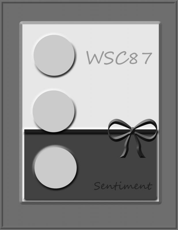
When I first saw Lori’s sketch, I wasn’t so sure I would like it.

wsc89doodles.jpg

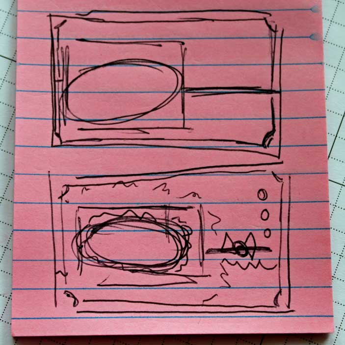
I don’t know what you guys do when you see a sketch, but me, I start doodling extra layers and scallops and what not until I have an idea on how my finished image might look like.

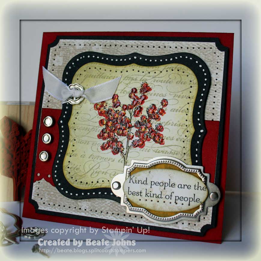
Then I pick colors, then the sets. Once my doodling was done, I knew I would like the card that would come out of the sketch. I knew right away that I wanted to add the Medallion background as backdrop for this card. I have been itching to use this stamp.

Colors, colors were harder. I wanted to play with the new in-colors, but their vibrance still scare me. So I just picked Soft Suede with Melon Mambo. I toned it even more down with Chocolate Chip and Very Vanilla and was ready to go. I tell you…the hardest part was picking a sentiment that would work with the sketch as well as the Medallion.

mambomedallionwsc89beate.jpg

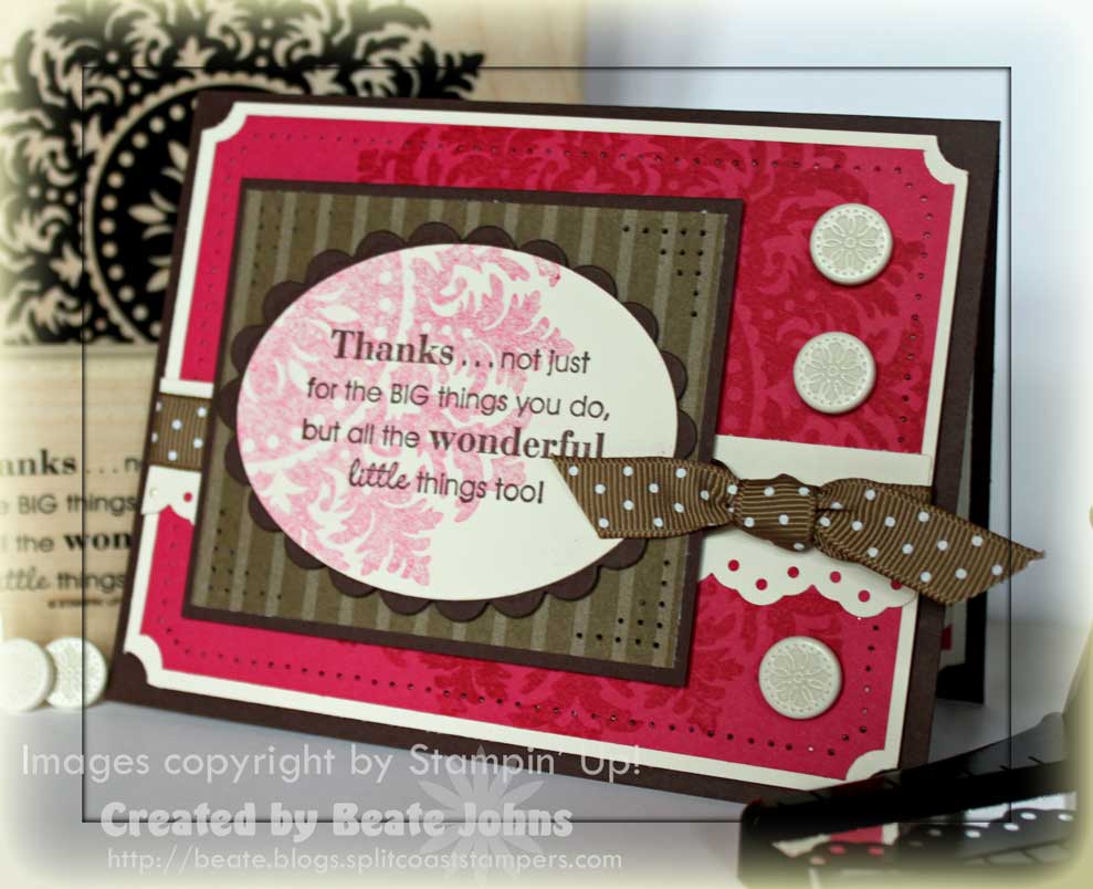
The card base is a 5 1/2″ x 8 1/2″ piece of Chocolate Chip cardstock piece folded in half.

Next comes a 4″ x 5 1/4″ piece of Very Vanilla. All four corners were punched with the ticket corner punch.

The 3 3/4″ x 5″ piece of Melon Mambo was stamped with the Medallion background stamp in Melon Mambo. Again all four corners were punched with the ticket corner punch.

I adhered the Melon piece to the Vanilla layer and paper pierced a border. Next I taped a 1 1/8″ x 5 1/4″ strip of Very Vanilla for my horizontal layer after punching it with the Eyelet Border punch. Soft Suede Polka Dot ribbon was tied above the strip.

The Chocolate Chip rectangle in the center measures 3″ x 3 1/2″ and was topped with a 3/8″ smaller piece of Soft Suede Pattern Designer Paper. I paper pierced all four corners and attached the layers to the card base Vanilla/Mambo layers with dimensionals.

For the sentiment I chose a saying from the set Full of Life. I stamped it in Chocolate Chip on Very Vanilla Cardstock and stamped the Medallion background over it in 3rd generation Melon Mambo. It was cut out with Oval Nestabilities and layered on a slightly bigger scalloped Oval in Chocolate chip. These layers were attached to the center rectangle with dimensionals.

To finish off the card front, I added three brads from the Vanilla Hodgepodge Hardware kit to the right side of the card.

mambomedallioninsidewsc89.jpg

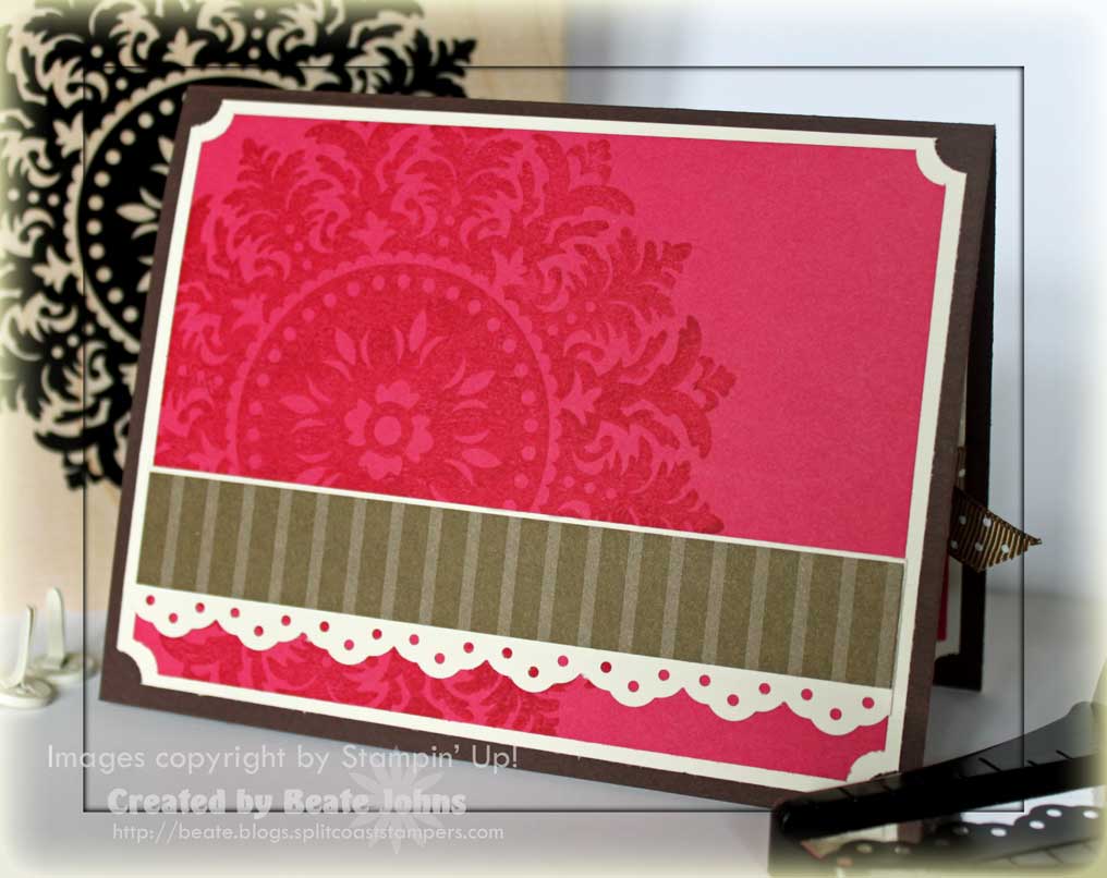
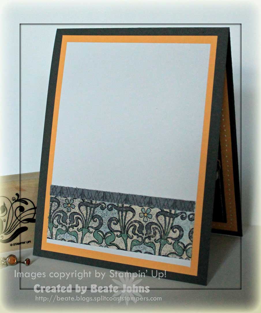
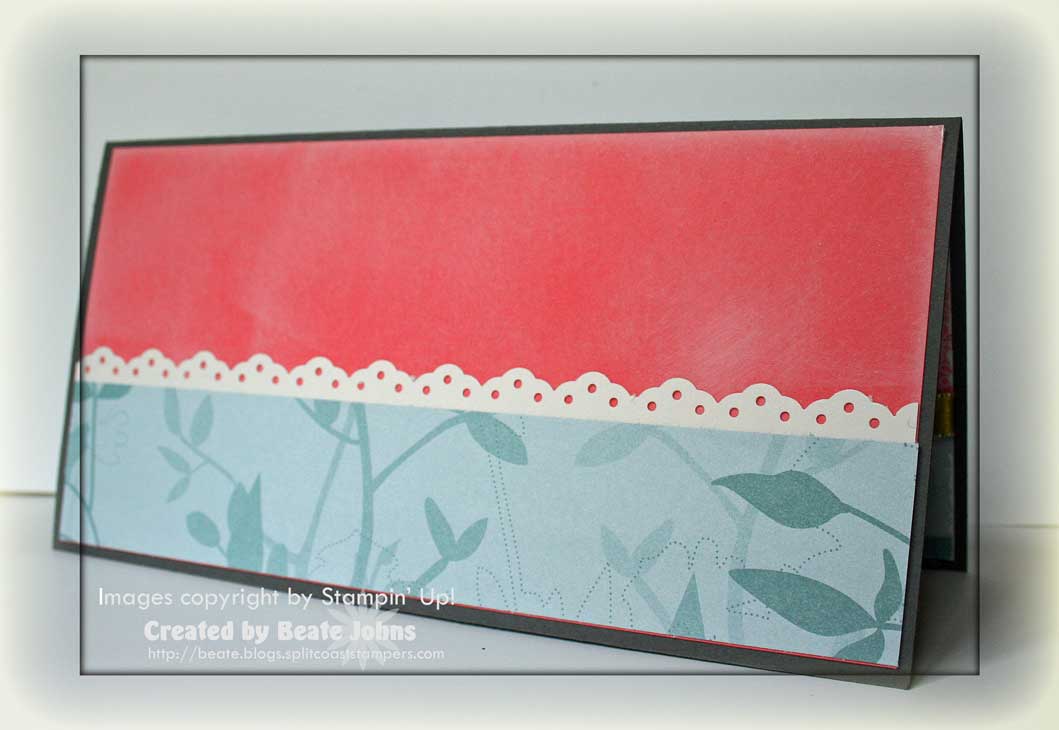
As always, the inside of the card mirrors the card front.

I added a 4″ x 5 1/4″ piece of Very Vanilla and a 1/4″ smaller piece of Melon Mambo to the inside.

Both layers were punched with the ticket corner punch.

The horizontal strip measured 1 1/4″ x 5″ and was punched with the Eyelet border punch.

A 3/4″ x 5″ piece of Soft Suede Pattern Designer Paper was taped above it.

Now that I see the card uploaded, I think with a different sentiment, it would make a great unconventional Christmas Card.

Have a great weekend. Hugs and smiles

 sc237.jpg

I was a bit behind on the challenges this week, so I decided to double up.

I made a card for the Color Challenge as well as the Sketch Challenge.

Not even the color combo this week could stop me. Lavendar Lace, Barely Banana, Whisper White and Basic Black.  It had to be purple in there to welcome me back. LOL

asianartistrycc227tlc229bea.jpg

My card base is a 4 1/4″ x 10″ piece of Basic Black cardstock folded in half.

I made the card a bit shorter then usual. It just didn’t look right as a regular 4 1/4″ x 5 1/2″ card.

Next is a 3 7/8″ x 4 5/8″ piece of Lavendar Lace.

I didn’t have current designer paper with the right colors, so I used paper from the newly retired Bella Bird and Urban Oasis Paper packs. The vertical strip measures 3″ x 4 5/8″ and has a scalloped edged Shimmery White cardstock edge on each side. The horizontal strip measures 1 7/8″ x 3 7/8″. Organdy Satin Ribbon was taped over it.

The main image is from the stamp set Asian Artistry. It was stamped in Black Stazon on Shimmery White cardstock. I added color to the stems with Barely Banana Marker and to the blooms with Aqua Painter and Lavelndar Lace Pad (you got to mute that purple!). I cut the image out with rectangular Nestabilities and sponged the edges with Barely Banana. Next I layered the image on a slightly larger piece of Lavendar Lace, then on a Scallop rectangle (cut with Rectangle Nestabilities).

The sentiment is from the new set Teeny, Tiny Wishes. It was stamped in Black Stazon on Shimmery White cardstock and punched out with the small oval punch. I stamped the main image in Barely Banana over it and sponged the edges in the same color.  It was layered on a 1″ circle in Lavendar Lace and a Designer Label punchout in Basic Black cardstock. An oval silver frame from the Styled Silver Hodgepodge Hardware collection was added over the sentiment to finish it off. To tie in the hardware, I added two more silver brads on the top left.

asianartistryc227insidebeat.jpg

The inside of the card is pretty basic.

Just a little more of the same cardstock and paper as on the front.

Have a wonderful day! Hugs and smiles

Today’s tutorial on SCS is written by Brenda Quintana and shows you how to make a darling Peek-a-Boo Box. I made my sample to match the Halloween card I posted on Monday. I really like the new Cast-a-Spell Designer Paper.

fromthecryptpeekaboobeate.jpg

The skull from From the Crypt is stamped in Black Stazon on textured White cardstock.

It was punched out with the 1 3/8″ circle punch and adhered to an Old Olive cardstock scrap piece. I cut close around it and layered that on to a Rich Razzleberry Scallop Circle. Clear Rhinestone brads in the eye socket finish of my centerpiece.

 photocornerpunch1.jpg

The sentiment is from All Holidays. It was stamped on Textured White cardstock. in Black Stazon.

The left edge of the cardstock was punched partially with the Photo Corner Punch to create the banner edge.

I shaped it slightly with mountain/valley waves and taped the sentiment to the box top with Sticky Strip.  The center image was adhered to the box with dimensionals.

fromthecryptpeekabooinside.jpg

The 1 1/2″ Whisper White cardstock square was stamped with a stamp from Eat, Drink & Be Scary in Old Olive.

It was layered on a 1 5/8″ Basic Black square and a row was paper pierced on the bottom edge. Then it was layered on a 1 3/4″ Rich Razzleberry square and taped to the inside of the box top.

The bat is from the From the Crypt set and was stamped in Black Stazon on Textured White Cardstock. It was cut out and taped with dimensionals under the wings over the sentiment.

I know it’s a bit early for Halloween projects, but I just love that set and paper.

Have a wonderful day! Hugs and smiles

kindandcaringmelonmarybeate.jpg

Check out this beauty!

One of the things I was excited about in Ohio is that Mary Brown lives only about 25 minutes from my house.

How lucky am I? I have been in awe of Mary’s cards ever since I started stamping. End of last month I finally got to meet her. She was kind enough to invite me over while some of her downline/sideline gathered at her house. We had pizza and she had prepped some cards for us to stamp. This was one of them. I had a blast!

I love the elegant feel of this card. And you know I love that Eyelet Border Punch. It’s just sooo pretty.

I didn’t get to stamp on Saturday. I got my nose stuck in a book again and couldn’t stop reading. After finishing the Wheel of Time series by Robert Jordan, I continued reading fantasty with Tad Williams Dragonbone Chair and then I stumbled upon Patricia Briggs . I love her easy to read, fun novels. I have almost read them all now and can’t wait until two new books are coming out in August.

Yesterday though, I didn’t touch a book all day. First church (we love our new church here. Our pastor used to be the pastor of Rick’s parents church in San Antonio, where we got married and the boys were dedicated. We couldn’t believe our luck that he is up here now.), then Cheesecake factory, then work, then the Featured Stamper challenge on SCS. That is such a great challenge for mojo challenged stamper like me. Casing stampers is fun!!!

vsndiane_by_schirmcat.jpg 

I checked out Kelly’s great gallery and decided on this card.

I love the layout and colors. So soothing.

Well…I wanted to try out new stamps and paper. I had ordered the Halloween paper and the new stamp set From the Crypt. I love the images in that stamp set. I decided to use the skull image for the case of this card.

fromthecryptfs127beate.jpg

The card base is a 4 1/4″ x 11″ piece of Rich Razzleberry cardstock.

It was layered with a 3 7/8″ x 5 1/8″ piece of Basic Black cardstock. The top two corners were punched with the ticket corner punch. Next were two 3 5/8″ wide pieces of Cast-a-Spell Designer Paper. Between both layers I added a 1″ x 3 5/8″ strip of Basic Black cardstock that had been punched with the Eyelet border punch. Striped Old Olive Ribbon was tied above the punched strip.

I stamped the skull in Black Stazon on a 2 1/2″ square of Textured White Cardstock and added a bit of Rich Razzleberry into the skull with the Aqua Painter. All corners were punched with the Ticket Corner punch. It was layered on a slightly bigger piece of Basic Black cardstock and then on a scalloped Rich Razzleberry square. The square had been cut with Nestabilities.

In the catalog sample for this set Clear Rhinestones were added into the skull eye sockets. I thought that looked cool and added Clear Rhinestone brads in mine. The sentiment is from All Holidays. It was stamped in Black Stazon on Textured White cardstock and was punched out with the large oval punch. I added a paper pierced row underneath and placed one Clear Rhinestone brad on the right edge.

It still didn’t look finished so I stamped the bat from From the Crypt in Black Stazon on Textured White cardstock, cut it out and taped it on the left hand side of the sentiment. I taped the body down with Sticky Strip and added dimensionals under it’s wings.

fromthecryptfs127closed.jpg

For the inside I layered a Whisper White piece of cardstock to a black cardstock piece.

On both the top corners were punched with the ticket corner punch.

I added a 1 1/4 strip of Cast-a-Spell Designer paper on the bottom of both layers and taped Polka Dot Razzleberry Ribbon dotted side down on top of the paper. I added a Clear Rhinestone brad on the right hand side.

When looking for something to add next to the sentiment in the front, I had stamped and cut out a spider along with the bat. Since the spider was already cut out, I used it for the card inside.

To get myself back into the stamping mood, I took Charmaine’s sketch from last weekend

wsc87.jpg

and combined it with yesterday’s Limited Supply Challenge.


wingsoffriendshipwsc87bird.jpg


I started this card by pulling out new Designer Paper.  I decided to try out the Nouveau Chic pack. You know me and muted colors. This years In-Colors are definitely going to be a challenge to me. They are so bright and fruity.

After deciding on the paper, I thought the bird from Wings of Friendship would go good with the paper and would be great for the challenges.

I stamped the bird three times on Whisper White cardstock in Basic Gray. Two images were punched out with the 1 1/4″ circle punch, one image was cut out with my paper snips. I punched out a plain 1 1/4″ Whisper White circle and stamped the swirl from Wings of Friendship in Apricot over it. For the bird circles, I added a bit of apricot swirls on the side of the bird. All three circles were layered on 1 3/8″ Basic Gray circle punchouts.

Next I stamped the bird twice in Sage Shadow, once in Apricot Appeal and cut their wings off. Those were mounted to my birds in the circles to tie in the colors of the designer paper more.

The card base is a 4 1/4″ x 11″ piece of Basic Gray cardstock folded in half. Next is a 4″ x 5 1/4″ piece of Apricot Appeal cardstock. A dotted border was added with a White Gel Pen.

The center rectangle is a 3 1/2″ x 4 3/4″ piece of Basic Gray Cardstock covered with three pieces of the Nouveau Chic Designer paper pack. When I first saw Charmaine’s sketch I had planned to use ribbon where the two bigger designer paper pieces met, but since the LSC challenge only allowed brads as embellishment, I used a 7/8″ x 3 3/8″ piece of Sage Shadow colored designer paper instead.

The birds were taped to the left hand side of the inner rectangle. I added the cut out bird with the apricot wing to the bottom. It just seems to look best there. To finish the card off, I stamped the sentiment of Wings of Friendship in Basic Gray on Whisper White, stamped Apricot swirl over it and punched it out with the large oval punch. It was taped to the right hand side of the sage strip, topped with a Filigree brad that holds a Fire Rhinestone brad in it’s center.

 wingsoffriendshipwsc87insid.jpg

I kept the inside pretty simple, like always.

I just like to add the same paper and cardstock to it to tie it into the front and make the card look finished.

I hope you all have a wonderful Saturday. It’s dark and gloomy here. I guess that will keep me in the house and  hopefully stamping.

Hugs and smiles

forallyoudowsc88resist.jpg

I started out with a 3 3/4″ square of Glossy Cardstock that I had tried the Cuttlebug Wax paper resist technique on last week. See I meant to make a sample for that Wednesday tutorial, but I only got the glossy cardstock prepped and never stamped.

I sanded the cardstock with sand paper to add a bit of Faux Linen look to the background. Then I sponged all over with Soft Sueve Ink. The edges were distressed with the Cutter Kit and then I sponged the edges with Chocolate Chip. The entire piece was layered on a 3 7/8″ square of Whisper White cardstock. The edges of that layer were distressed as well.

The top 7/8″ x 3 3/4″ piece of Bermuda Bay Cardstock was stamped with the border strip from Pendant Park in Bermuda Bay. I added paper pierced holes in each of the small diamonds, then added a paper pierced row above and underneath the stamped strip. The edges of that cardstock strip were distressed.

The bottom of the lower Bermuda Bay cardstock strip was punched with the Eyelet border punch, the top was distressed. After taping the strips down, I tied White Satin Ribbon was tied around the bottom strip.

The Whisper White and Chocolate Chip rectangles were cut with Rectangle Nestabilities. The flower stem from For All You Do was stamped in second generation Soft Sueve. I inked up both the small and medium flower from the same set were inked with Bermuda Bay ink, then outlined with the Bermuda Bay marker before stamping them next to the stem. I stamped the medium flower again, cut it out and mounted it with a dimensional slightly overlapping the stamped flower. A brown brad tops this flower off. The small flower has a small clear Rhinestone brad in it’s center. The sentiment is from the same set and is stamped in Chocolate chip ink.

The card base is a 4 1/4″ x 8 1/2″ piece of Chocolate Chip cardstock. The edges of the card front were sponged to make them look darker and richer.

As you can see I couldn’t add all those flowers from the sketch on the front. So I decided to add them on the inside of my card.

forallyoudowsc88inside.jpg

Please be gentle with me when you judge the card.

I haven’t stamped in ages and feel like I have zero mojo. I hope I will find my mojo and my stamping rhythm again soon.

Have a wonderful weekend!

Hugs and smiles

softsummerwsc75beate.jpg
Here is my sample for MJ’s awesome sketch this week.

I knew I wanted to use the beautiful flower stamp from Soft Summer. To do so, I had to make my card a bit bigger then regular. I would mail this one with a business size envelope.

The card base is a 8″ Basic Gray square folded in half. Both Designer strips are from the Walk in the Park Designer Paper pack. The upper one measures 2 1/2″ x 7 3/4″, the lower one 2″ x 7 3/4″. I overlapped them slightly.

 The layers for the main image measure 3″ x 5 1/2″ for the gray layer. The bottom was punched with the Eyelet Border punch. The Kiwi cardstock measures 2  3/4″ x 5 1/4″ and the Shimmery White Layer is another 1/4″ smaller.

The flower was stamped with Basic Gray ink on the left hand side of the Shimmery White cardstock. I stamped the flowers again, colored them with Aqua Painter and classic inks (Cameo Coral, Kiwi Kiss and Baja Breeze), cut them out and layered them over my main image. The sentiment is from from the Soft Summer stamp set as well.

I added a white Jumbo Grommet through one of the big flowers from the Pretties kit and added a Baja Breeze Ribbon knot in it’s center.

I am sorry I don’t list all the details, but it’s been almost two weeks since I made this card.

softsummerwsc75insidebeate.jpg

The inside of the card is kept pretty simple.

The 2 3/4″ x 7 3/4″ piece of Cameo Coral cardstock muted with White Craft Ink.

The designer paper is from the Walk in the Park Designer Parks.

Have a wonderful  day. Hugs and smiles

wsc75.jpg

Mary Jo Albright is the hostess for this weekend’s sketch challenge.

Make sure you visit her blog and post your entries there.

And visit

Charmaine Ikach

Jenn Balcer

Laurie Schmidlin

Lori Craig

Mary Jo Albright and

Sharon Harnist’s  blogs for more samples.

Have a great weekend. Hugs and smiles

P.S.: Sorry about the mess up with this post. I don’t know where it came from but it should have been posted April 03rd, not on the 25th. Weird. Sorry!!!

Here is a card I made for the Color Challenge two weeks ago. The colors were Summer Sun, Kraft, Riding Hood Red and Black.

soft-summercc210beate.jpg

The card base is a 4 1/2″ x 9 piece of Riding Hood Red cardstock folded in half. The edges were sponged

Next is a 4 1/8″ Basic Black square. The corners were punched with the ticket corner punch. It was layered with a 4″  square of Parisian Breeze Designer paper that was sanded. The edges were punched with the same punch as well. The paper was sanded and the edges were paper pierced.

The horizontal strip measures 1 7/8″ x 4″  and is sponged Riding Hood Red cardstock. The bottom edge was punched with the Eyelet Border Punch and three clear Rhinestone brads were added to the left hand side.

The the full berry image was first inked up with Summer Sun. Riding Hood Red ink was added with Fantastix over the berries, Sahara Sand over the stem. Then the image was stamped on to Whisper White cardstock. Next I masked the image and stamped En Francais over it with Sahara Sand. I cut the image out with Label Nestablities and sponged the edges first with Summer Sun, then with Sahara San. It was layered on a black Nestabilities cut out and white gel pen dots were added all around. A small hole was punched on the top right and White Taffeta Ribbon was tied down with a Hardware piece from the Styled Silver Hodgepodge Hardware.

I punched out a designer label out of Summer Sun and sponged it with Sahara Sand. Next the sentiment was stamped in Black Stazon on Whisper White and punched out with the large oval punch. It was taped to the Designer label punchout, paper pierced and taped to the image. Another Styled Silver Hodgepodge Hardware piece was added over it.

We will be in Trier today all day. I can’t wait to show the kids the Roman ruins there. It’s the oldest German city and goes back to 58 B.C.

© 2012 fresh & fun Suffusion theme by Sayontan Sinha